THEME · SECTIONS · OS 2.0 · 10 FEBRUARY 2026 · 7 MIN READ
Theme settings that merchandisers understand
A setting is a question you are asking a colleague at four o’clock on a Friday. Most theme settings are a developer thinking aloud.
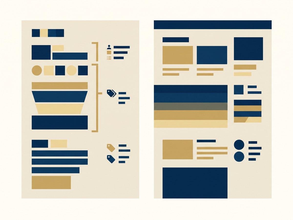
Design theme settings the way you would design a form for a customer: write the label before the code, choose the setting type that makes the wrong answer impossible, hide the settings that do not apply with visible_if, and ship defaults that produce a publishable section before anyone touches anything. A setting named for the CSS property it changes, offering a free-text value, visible whether or not it is relevant, is a developer’s mental model leaking into somebody else’s Friday afternoon — and it is how a theme ends up with pages nobody can explain.
IN SHORT
- Write the setting label as the question a merchandiser would ask out loud, then build the input that answers it.
- Prefer a `select` of named options over free input: a colour scheme beats a colour picker, three named spacing steps beat a pixel field.
- The `visible_if` attribute hides settings that do not apply, referencing `section.settings` or `block.settings` — an irrelevant setting is worse than a missing one.
- Resource pickers — product, collection, page, image — do not support a `default` and are not updated when switching presets, so every section must look publishable while they are empty.
- A section can hold up to 50 blocks, and `max_blocks` sets a lower ceiling: pick the number that keeps the layout intact rather than the number the platform allows.
- A `liquid` or `html` setting is an escape hatch, and each one is a signal that the section is missing a real setting.
Write the label before you write the schema
Open the theme editor on almost any inherited theme and you will find settings called "Enable overlay", "Content width", "Padding top" and "Section style". Each of those names describes what the code does. None describes the decision the person is making.
The fix is to write the label first, in the words a merchandiser would use if they were asking a colleague. "Should the text sit on top of the image?" becomes a checkbox labelled *Text over image*. "Padding top" becomes *Space above this section*, with three named steps. "Section style" becomes *Background* with the actual scheme names. The schema follows from the sentence, not the other way round.
Sidebar settings — the informational elements that hold no value — are where the remaining explanation goes. A header grouping four related settings and a short paragraph saying what a group is for removes most of the questions your team currently sends to a developer. If a setting needs a paragraph to be usable, write the paragraph; if it needs two, the setting is wrong.
Choose the type that makes the wrong answer impossible
Shopify gives you a long list of input settings, and the choice between them is the difference between a constrained system and an infinite one. A few rules we apply without arguing about them:
Named options over free values. A select or radio of three named layouts cannot produce an unrecognisable page. A text field asking for a CSS value can. The same logic makes color_scheme the right answer where teams reach for color: schemes are defined once at theme level and applied by name, so a section is on-brand by construction. If you must offer colours directly, color_palette takes between 2 and 20 named colours — a palette, not a wheel.
Know how your select will render. Shopify renders a select as a dropdown if it is grouped, has more than five options, or overflows the sidebar; otherwise it is a segmented control. That is a real design consequence: keep the options you want visible at a glance to five or fewer, and use the group attribute when there are genuinely more.
`range` for numbers a human should not type. It needs min, max and a default, and those must be numbers rather than strings. Its value is that the ceiling is yours: a slider from 1 to 6 columns cannot produce eleven columns on a phone.
Use the purpose-built types. text_alignment gives the icon control everyone recognises rather than a three-option select you wrote yourself. image_picker supports alt text and a focal point — and the focal point only survives if the template renders through image_tag. metaobject and metaobject_list point a section at structured content, where metaobject_list accepts up to 50 entries and each setting is locked to one metaobject type at a time.
One quiet trap: placeholder text on text and textarea settings only appears for settings defined in settings_schema.json. Rely on a placeholder to explain a section setting and your merchandisers will never see the explanation. Put it in the label or a sidebar paragraph instead.
Hide what does not apply
The cheapest usability win available in a Shopify theme is conditional settings. The visible_if attribute takes a Liquid condition referencing section.settings or block.settings, so a setting appears only when it is relevant:
"visible_if": "{{ block.settings.layout_style == 'flex' }}"
Applied properly, a section with eighteen settings behaves like a section with six, because thirteen of them are answers to questions the merchandiser has not been asked yet. A video section stops showing autoplay controls when the media is an image. A button group stops showing link fields when buttons are switched off.
Two limits to know. Not every setting type supports it — the basic inputs, sidebar settings and a curated set of specialised ones do. And conditions cannot see runtime context or resolved dynamic source values: you can check whether a setting with a dynamic source has a value, but you cannot branch on what that source resolves to. So design conditions around choices the merchandiser has made in the editor, not around the data the page will eventually contain.
Defaults and presets are the documentation nobody reads but everybody uses
The first thing that happens to a new section is that somebody adds it and looks at it. Whatever appears at that moment is your instruction manual. A section that renders as an empty band with an "Add content" placeholder has failed the only test that matters, and a section that arrives looking like the design in the brief has taught the whole thing in two seconds.
The constraint to design around is that resource pickers do not support defaults. Product, collection, page, blog, article, image and video settings cannot ship with a value, and — this is the one that catches teams out — picker settings are not updated when a merchandiser switches presets. So a preset can carry your headings, layout choice and spacing, and it can never carry the product. Every section that depends on a picker needs a deliberate empty state: a sensible fallback, or a clear message in the editor saying what to choose.
Where presets do earn their keep is as named starting points for the same section — *Editorial split, image left*, *Editorial split, image right* — so that the merchandiser picks an outcome rather than reverse-engineering one out of nine settings. That is a better use of presets than treating them as a second section list.
Give every section a ceiling
Shopify permits up to 50 blocks per section, and you can set a lower limit with max_blocks. Take the lower limit. Almost no layout survives fifty of anything: a logo bar looks deliberate at eight and desperate at thirty, and a testimonial carousel that allows fifty entries will eventually contain fifty. The number to choose is the largest count the design still looks right at, which is a question for whoever drew it.
The section limit attribute does the same job at page level, accepting a value of 1 or 2 — worth setting on anything that only makes sense once per template, such as a hero or a newsletter band. enabled_on and disabled_on are the related control: a section that has no business on a product template should not be offered there at all. Every option you remove is a page you do not have to fix later.
Escape hatches are a signal, not a feature
The liquid and html settings let a merchandiser paste markup into a page. Both have rough edges by design — a liquid setting cannot exceed 50kb and has no access to layout, schema or stylesheet tags, and an html setting strips <html>, <head> and <body> and silently closes unclosed tags for you.
They exist for genuine one-offs and they are not the problem. The problem is what a custom HTML block on the page means: somebody needed something the section library did not offer, and solved it in a way that no future redesign will find. Audit them periodically. Two custom HTML blocks doing the same thing on different pages is a section you have not built yet, and the honest response is to build it and delete the markup.
Test it with a merchandiser, in twenty minutes
You cannot judge your own settings, because you know what they do. The test is cheap: sit with whoever builds pages, give them a brief — "a campaign landing page for the spring range" — and watch without helping.
Where they hesitate is a label problem. What they leave on default is a setting to remove. What they ask you about is a missing sidebar paragraph. What they achieve by pasting HTML is a section that does not exist yet. Twenty minutes of that produces a better backlog than any amount of internal review, and it is the same exercise we run when we take over a [theme customisation](/services/build/shopify-theme-customization) and need to know which half of the settings are load-bearing.
The standard worth holding yourself to: a merchandiser who joined last month can build a publishable page without opening a document or messaging a developer. Everything above is in service of that one sentence.
Questions this raises
How do you design theme settings for non-developers?
Write each label as the question the person is actually answering, use named options rather than free input so the wrong answer is impossible, hide settings that do not apply with `visible_if`, ship defaults and presets that render a publishable section immediately, and cap repeatable blocks at the number the design survives. Then watch a merchandiser build a page with them and fix whatever made them hesitate.
What is the right number of settings on a section?
The smallest number that covers the pages you actually publish. A setting that has only ever been left on its default is a setting to delete, and a section with twenty settings is a small product that needs documentation and support. Conditional visibility helps, because it lets a section with more settings behave like one with fewer.
Colour picker or colour scheme?
Colour scheme, nearly always. Schemes are defined once at theme level and applied by name, so sections stay on-brand without anyone remembering a hex code, and rebranding is one edit rather than a crawl of every page. Where you need direct colour choice, a named palette of between 2 and 20 colours is the constrained version of a picker.
Can a section preset include a chosen product or image?
No. Resource pickers — product, collection, page, article, blog, image and video — do not support a default value, and picker settings are not updated when switching presets. Presets can carry text, layout and style choices only, so design every picker-dependent section to look deliberate while it is still empty.
Should we allow custom HTML in sections?
Sparingly, and treat every use as a bug report. The `html` and `liquid` settings are legitimate escape hatches for one-offs, but each one is markup outside your design system that a future redesign will not find. If the same custom block appears twice, build the section it is standing in for and remove it.
How many blocks should a section allow?
The platform limit is 50 per section and you should almost always set `max_blocks` lower. Pick the largest number at which the layout still looks intentional — typically three to eight for feature rows, more for a logo bar — and ask the designer rather than guessing. An unconstrained block count is how a tidy section becomes an unreadable wall.
NEXT STEP
Free store audit
A senior Shopify engineer reviews your storefront, theme performance and checkout, then sends a prioritised list of fixes.